The advent of the Year 2019 can also be seen as getting close to the end of the decade. The decade which has seen the phenomenal growth of the internet is about to end. These 10 years have witnessed, the reign of mobile, an introduction of AR, VR, AI, AMP and many more acronyms.
Together with the aforementioned innovation in technology, there have been some remarkable changes in the web design landscape. This drift is kind of inevitable with the changing size of the screen on which users will be accessing the web and visit the website. Experts believe that the year 2019 will be all about bringing aesthetics and technology together like never before. Below goes the list of web design trends that are likely to dominate throughout the year. However, a power to leave a mark on the decade is vested in the hands of web designers.
- Rotating Animations
There cannot be a better way to keep your users surprised than switching up your content. This way the users stay curious for more. For instance, the homepage of a website has a new and innovative brand video to see with every refresh. Other websites have chosen to rotate the titles of articles. The essence of this exercise is to leave users a unique experience every time they come to your website.
2. Unconventional Scrolling

Another interesting way of grabbing users’ attention is by experimenting with different scrolling techniques. Switching from the traditional vertical scrolling, Aces, a baseball recruiting agency, has dabbled with scrolling technique to catch the attention of visitors on the important aspects of their business. As the year advances, businesses may come up with more non-traditional scrolling techniques. Fingers crossed!
3. Designs Containing Gradients
After Instagram re-branded their logo to the magenta gradient, it became a rage in the industry. It was so different and the result was so impactful that it has emerged now as a whole and popular design choice.
4. UX Driven Diagonal Lines

While straight and horizontal lines were used to separate sections on website’s pages, after conducting some UX research diagonal line design is found to be visually intriguing and it also creates a directional purpose which intrigues users’ eyes to follow down the page or point to a call-to-action. Using diagonals will ensure an increase in the number of users that scroll through the complete length of your site.
5. Color Branding
One more interesting creative to deploy in your site is the multiple color branding looks. When the user navigates and interacts with the product or pages through the site with help of visual color cues he actually associates with product or service page.
6. Designs With Depth
Creating flat designs that just appear 3-dimensional make the web page more appealing and even persuade sales. Use of drop shadows and varying colors is tested method of adding depth and giving a complex look to the website.
7. Large Titles Grab Eyeballs
In the saturated web world, it is not easy to catch users’ attention. In order to draw attention to the content, it is vital to include large and bold titles. At the same time, you can convey the message to the audience by shortening the content that is important too.
8. Capture Attention With Abstract Shapes

Top designers are in love with the trend of using abstract shapes. Adding the abstract shape elements give an appealing look and cutting edge to your site. This helps users stay intrigued.
9. Add Details In The Footer
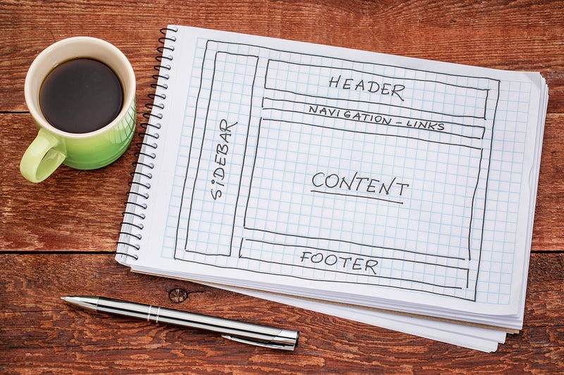
Footer of a web design cannot be ignored any longer. They need not be dull and monotonous. It is time to experiment and have detailed footers in your sites and help the design stand out. They will not only be informative but also will give an attractive look to the whole web design.
If you have gone through the curated list of most promising web design trends, you must have noticed one thing which remained unchanged was amazing user-experience; yes it will remain at heart of each one of them. Designers have rolled their sleeves up to grab users’ attention and to retain them on the page for a length of time. Sit and talk with Web design and Development Company that has a mantle to optimize these trends for your business.


